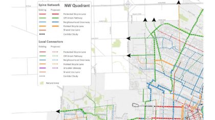
The Federal Highway Administration (FHWA) recently released the Bike Network Mapping Idea Book, a resource that highlights ways communities of different sizes have mapped their existing and proposed bike networks. The book is intended to serve as a resource for communities working to identify, plan, and improve their bicycle networks. The mapping idea book shows examples of maps at different scales and from rural and urban areas. Seven of the featured maps, including Yellowstone, Albemarle, Idaho Falls, Atlanta, Salt Lake City, Seattle, and North Santa Clara County were created by Alta’s GIS and Graphic Design teams.


What goes into the mapping strategies and techniques that result in an effective and visually appealing map? Having created hundreds of maps, our team brings you this list of tips for making a great map.
Design Tips
- The most important thing you can do is to create a visual hierarchy of information. Prioritize your content and dial back information that is not as important so the crucial content “pops off the page”. It helps to ask, “What is the number one thing I would like to communicate on this map?” This is especially important for complex maps with large amounts of data.
- Brighter colors will call attention to the most important elements, and using subtler colors for background information will help with readability.
- More is not always better. Consider a schematic design if it’s appropriate to your purpose. The New York City subway map is a classic example of a highly functional yet simple map. Remember, maps don’t always correspond exactly to real-world conditions.
GIS Tips
- Delete extraneous data before you export your map. Do you really need to show all building footprints and parcel lines? Does every side street and alley need a label? Reduce clutter and increase legibility by turning off layers.
- Exporting from ArcGIS to an Adobe Illustrator file allows the layers you built in ArcGIS to translate over to the latter, more graphically-rich program, where you can refine the design for greatest visual appeal.
- Use bookmarks in ArcMap to define extents of different areas of your map. Doing so makes going back and forth between areas a snap and makes exporting new or updated data to Illustrator a matter of a few clicks.
For User Maps:
Above all else, great maps are functional and meet the needs of the intended audience. If you’re giving a friend directions from your favorite cafe to your house, a crude drawing is sufficient. Scribblings on scraps of paper and diagrams drawn on napkins can be good maps, as long as they let you go from Point A to Point B reasonably efficiently.

- Simplify the street linework for a cleaner appearance. Jagged and wiggly line work in a city with a grid street network makes the map look messy.
- Use sans serif fonts for street labels. They’re easier to read at small sizes.
- Use the universally recognized safety color scheme to make it easy for readers to grasp opportunities and constraints — green for safe facilities, red for dangerous areas.
- Is your map usable by colorblind people? There are a number of resources available to help you design maps usable by the colobrlind community:
- GISLounge’s article “Making Color Blind Friendly Maps”
- Color Oracle, a free color blindness simulator
- ColorBrewer, which creates color schemes that you can check for color blindness compatibility
What do you think makes a great map? Share in the comments below.